We use cookies to improve the services we offer you. By continuing to browse this site, you consent to keep them in accordance with our Privacy Policy.
×We use cookies to improve the services we offer you. By continuing to browse this site, you consent to keep them in accordance with our Privacy Policy.
× 33,907
 12 min
Your YouTube banner, or channel art, is an important part of your channel’s branding. It’s basically “the face” of your blog, the first thing a user sees when they land on your page. So you’d better make it good, right?
We’re here to help! Read on for our ultimate guide to YouTube channel art and create the perfect banner for your blog!
First, let’s review the size and format you can use for your banner. Here are Google’s requirements:
In addition to these recommendations, you’ll also want to consider “the safe area” in which you’ll place all the important text and images so they’re visible on any device your viewers use. On smaller screens, like smartphones and tablets, YouTube will crop your banner, so make sure to place all the important information in the middle.
Here are the dimensions of banners that YouTube shows on different devices:
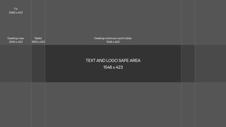
The last dimension, 1546 x 423 px, is the safe zone. If you fit all the essential information in that sized-space, you can be sure that your channel cover will look great on every device.
Beyond the above, there are no other real restrictions to what your YouTube channel cover should look like. So now you can get as creative as you want.
You can fill your banner with general information about your channel and your posting schedule, or you could just use an attractive image that grabs viewers’ attention. Both options are good.
If you need some inspiration, here are some of the common types of banners we found on YouTube:
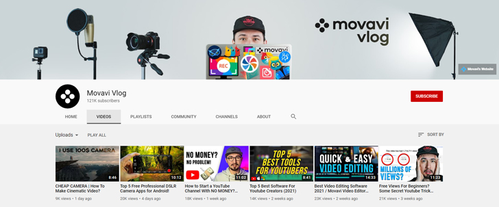
Many YouTubers use a photo of themselves as the main focus of their channel art. This type of banner is often used by vloggers, celebrities, and other creators whose blog is built around their personality.
According to Amra Beganovich, the founder of an influencer marketing agency in NYC, personal photo banners are also used as branding tools for influencers. They communicate the substance and the quality of the channel.
As you can see, we’ve used the same strategy for the Movavi Vlog channel art. Roman is the main expert on our blog. That’s why you see him on the cover, doing what he’s best at – creating new content for YouTube.
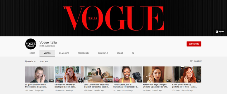
One of the easiest banner “genres” to make is the minimalist one. If you already have a logo and know what colors go with it, you can create your channel art in under ten minutes.
But remember that easy doesn’t mean simple-looking. This kind of banner can look very stylish and cool. Check out the official Vogue, Chanel, Louis Vuitton, and other YouTube fashion channels for some great examples of minimalist art.
If minimalism is not your style, you can find or create a picture that reflects your channel’s main focus. You’ve definitely seen this type of cover on travelers’, artists’, and artisans’ channels. By uploading a representative shot as your banner, you can be sure that viewers will get a feel for your channel the second they open it.
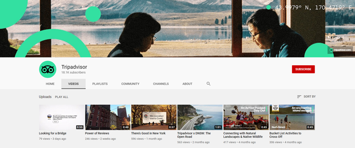
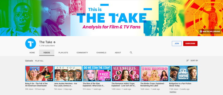
If there are too many good pictures for your channel and you can’t choose just one, maybe you can create a collage from them.
Collages are a frequent choice on channels with reviews of movies, books, or music. For instance, by gathering images from different films and TV series in your banner, you’re clearly showing that on this channel your focus is on cinema and exploring all aspects of the form.
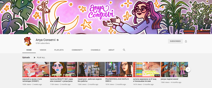
Another option for creative people on YouTube – your own artwork. Digital artists and designers often use this approach, so viewers can appreciate their art as soon as they arrive at their channel.
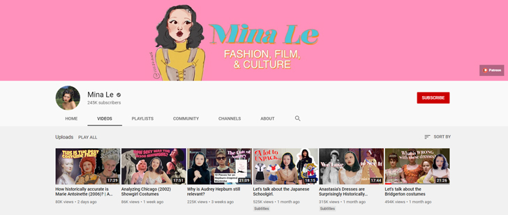
But even if you’re not an artist, you still can use this approach. For example, you can use a portrait of yourself, as Mina Le did:
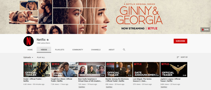
Some creators see their banner space as an opportunity to market their latest output. For example, Netflix often uses its channel cover to announce new releases:
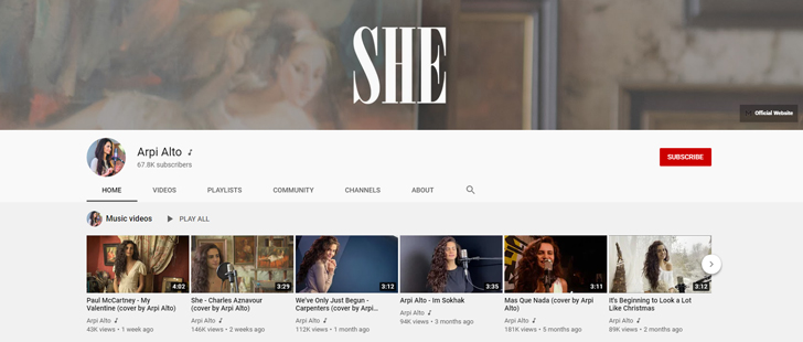
YouTube musicians use this strategy, too. It’s a good way to notify subscribers that there’s a new song on Apple Music or Spotify. One minor disadvantage of this method is that you do have to keep updating the banner image – you can’t just upload it and forget about it for a year or two.
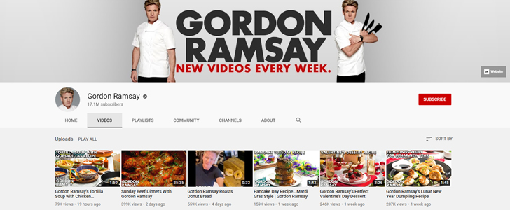
Some bloggers put their posting schedule on their channel art image. If you are ready to commit and post one or two videos every week, this is a good way to let your viewers know. This can help viewers get into the habit of checking your channel for updates once or twice a week – and that’s very good for your channel’s growth.
You can follow Gordon Ramsey’s example and describe your schedule in a few words:
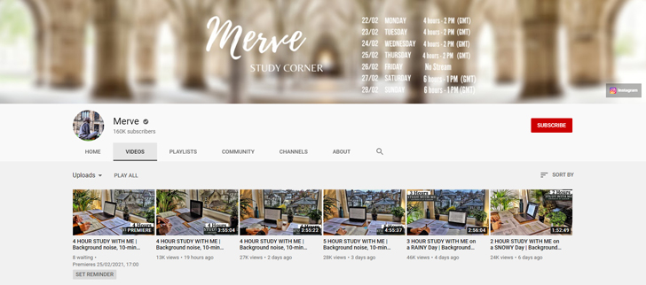
…or, if you do live streams, you can put the dates and hours for the next week or month in your banner picture:
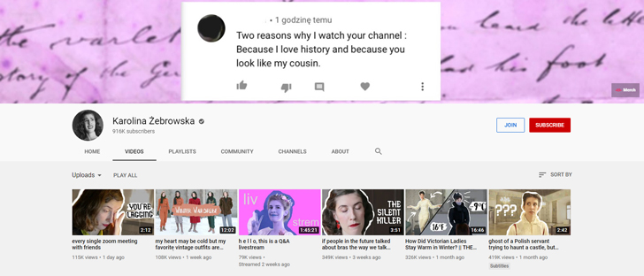
If you like joking around on your channel, no matter the topic, think of something funny to put up as your banner picture. Look, for example, at what Karolina Żebrowska did – she found a crazy comment about one of her videos and used that in her channel art.
Basically, you can use any graphics software to create a YouTube banner – even online. Here are some of our favorites.
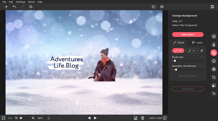
If you’re not an expert in graphic design, it’s best to use something simple and beginner-friendly. Give it a shot with Picverse, a photo editor designed specifically for non-professional users. To create a banner, use the background removal feature. This tool will help you to cut your silhouette out of a regular photo and change out the background in just a couple of clicks.
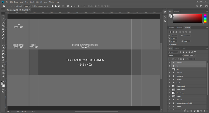
If you want something more sophisticated for your channel art, you’ll likely have to use a more complex program like Photoshop. We’re sure this software doesn’t need any introduction – you probably already know it can help you do almost anything when it comes to editing images. Photoshop’s main downside is that it’s not very easy for beginners – it will take some time for you to get comfortable using its powerful tools. Also, it’s rather expensive at $20.99 per month.
That said, you can expedite your creative process by leveraging digital assets available on platforms like Envato Elements. With access to over 18 million resources fueled by a diverse community of professional creatives, you’ll find a vast array of templates, illustrations, effects and more to enhance your YouTube art. Utilizing these assets not only streamlines your workflow but also empowers you to elevate your creativity to new heights.
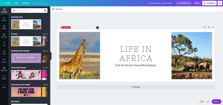
Canva is a great online tool for digital marketers and creators. The platform features tons of ready-to-use customizable templates for YouTube channel art. You can use one of those or you can create your banner from scratch using the blank mode.
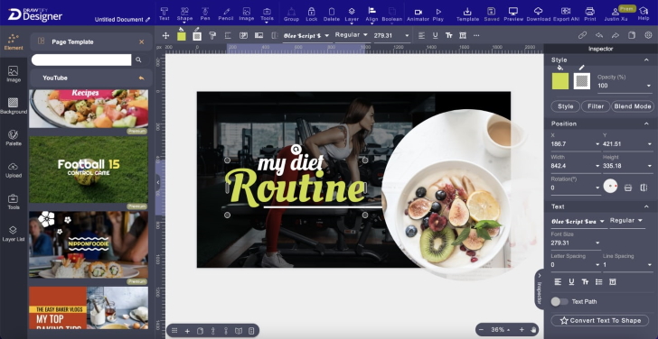
Drawtify Youtube Banner Maker is a Free Online Vector Editor with Great Youtube Banner Templates and Elements. It’s a SaaS tool for people who want to make designs easily and quickly with templates.
The Drawtify YouTube Banner Maker brings some powerful tools for designers to draw what they want and gives many beautiful templates and design elements for non-designers to make a design quickly.
You can create vector banners online for free, and even SVG graphics, vector logos, infographics, flyers, posters, business cards, etc.
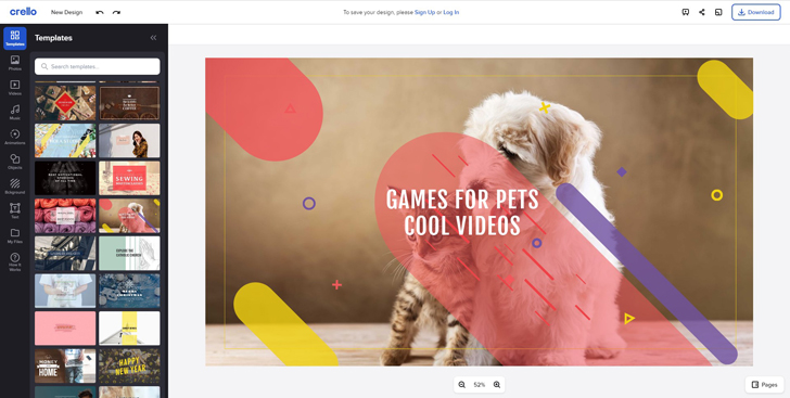
Another popular online app is Crello. It also has many free-to-use templates, as well as thousands of stock pictures to make your channel art stand out.
This, of course, is not all. There are many more high-quality YouTube banner makers to choose from.
As we said at the beginning, there are no real limits to your creativity when it comes to YouTube channel banners. But there are some basic unwritten rules that will help you get the most from your cover picture.
1. Develop a recognizable style for your channel.
Any marketer or brand manager will tell you that this is a good idea. Not only does it make your channel look good, but it also makes your audience associate certain colors and images with your channel. And that will naturally do good for your blog.
Try to create your banner, logo, and even your video covers in one consistent style – this way, viewers will be less likely to scroll past your videos on the YouTube main page.
2. Use only high-resolution pictures
Yes, this may seem obvious, but it’s good to be reminded. Your banner picture and all of its components should be of the highest possible quality. No blurry or pixelated photos or icons on your channel cover! Otherwise, what would users think about a video creator who can’t take care with one simple picture?
3. Add a call-to-action and/or social media links
The channel cover is the first thing users see when they open your blog on YouTube. This makes it the perfect place for a call-to-action (CTA) or links to your other social media accounts.
If you notice that many people visit your channel and watch your videos but don’t subscribe to your channel, you might want to remind them to hit that button. Or, if you want to draw more attention to your Instagram or website, you can add clickable buttons to your banner. Here’s how:
4. But don’t overload it with details
CTA, links, personal photos, additional icons, schedules – this is all good… But not when you cram it all into one banner. Keep it simple and readable – don’t overwhelm your viewers before they even open your first video.
Set your goals and then choose the elements to use on your channel art. Want to get more subscribers? Add a CTA. Want to make your channel a little bit more personalized? Add your picture. Want to get more leads to your website? Add links and arrows pointing to them.
5. Keep in mind the basic rules of composition and color schemes.
To make your picture pleasing to the eye, use tried-and-true composition tricks. For example, apply the rule of thirds or use symmetrical composition in your image.
Also, remember about color compatibility rules. To learn more about this topic, read our article on Itten’s Color Wheel. We recommend using complementary and analogous color schemes – they are the easiest to apply.
Okay, now your banner is ready, it’s time to upload it to your channel. Here’s how you do it:
1. Log in and go to your channel page
2. Click Customize Channel

3. Go to the Branding tab

4. Find Banner image section and hit Upload
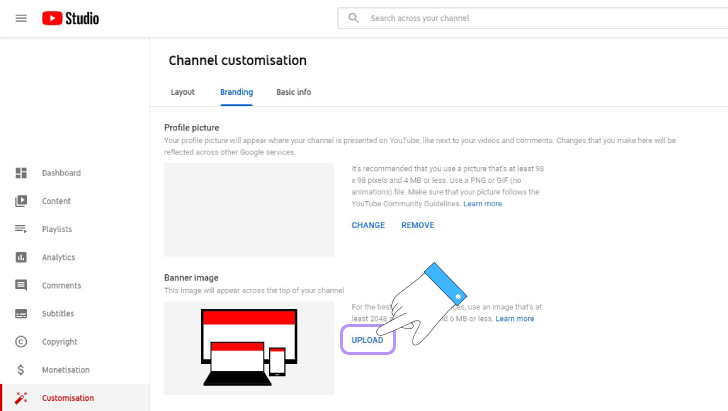
5. Choose your file and press Open
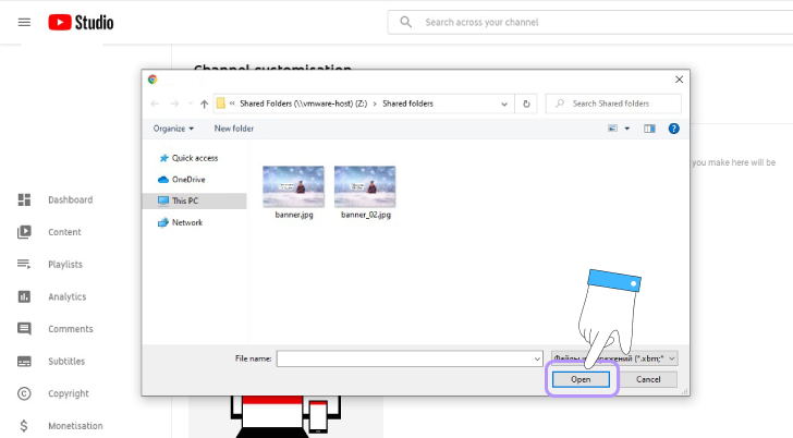
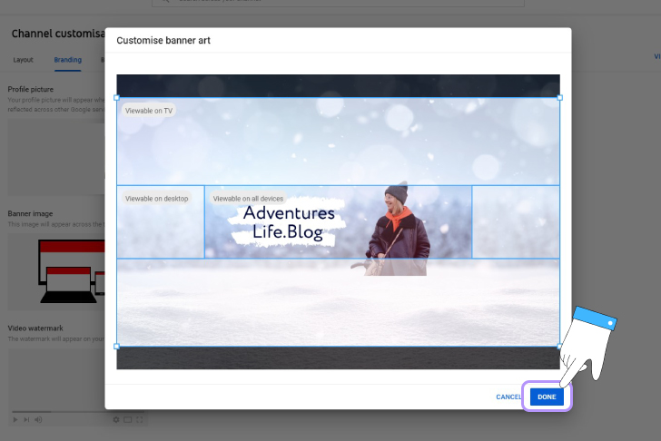
6. Drag your image and fit it into the YouTube template. Hit Done
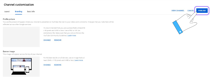
7. Click Publish
And that’s it! We’ve told you all we know about how to create YouTube channel art with or without YouTube banner maker. We hope that our tips will help you create a perfect image for your channel. Good luck 😉