
We use cookies to improve the services we offer you. By continuing to browse this site, you consent to keep them in accordance with our Privacy Policy.
×We use cookies to improve the services we offer you. By continuing to browse this site, you consent to keep them in accordance with our Privacy Policy.
×
 47,637
 7 min
7 min
So you’ve learned the basic rules of composition and figured out how to work with lighting. What’s next? Understanding color theory and the relationships between hues will really take your photos and videos to the next level.
Color is a truly powerful tool that helps you tell your story, set the right mood, emphasize certain elements in your work, and in general, make everything look better and more complete. One of the most basic and easiest-to-use tools to help you combine colors effectively is Itten’s color wheel.
Quick info:
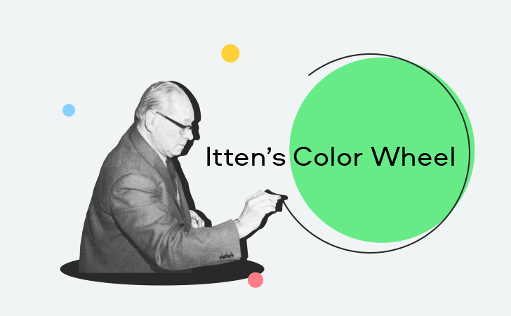
Johannes Itten was a Swiss-born painter and art theorist. While his expressionist works certainly deserve close attention, Itten is primarily known for his innovative thoughts on color theory. In the 1920’s he taught at Bauhaus, a famous German art school, where he developed a course to teach students the basics of color theory. The great thing about his study was that it synthesized earlier works on color theory, analyses of famous works of art by artists through the ages, and even the chemical composition of pigments, but was (and is) easy for anyone to understand and use.
Many artists still rely on the principles described by Johannes Itten, including filmmakers, photographers, web designers, illustrators, and stylists. Basically, everyone whose job is somehow connected with selecting and combining colors on a single surface.
The Itten invention that’s most used today is his color wheel (also known as the twelve-part color circle). It’s a graphical scheme that consists of geometric shapes of different colors.
Here’s how it looks:
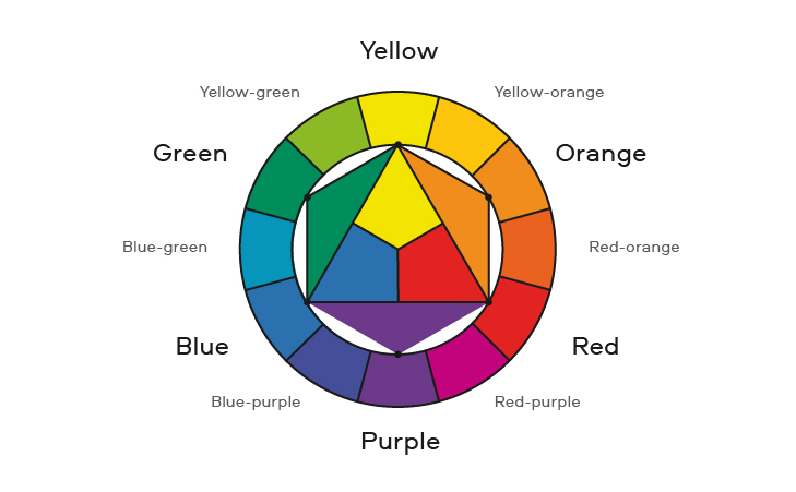
In the center are the three primary colors – yellow, blue, red. You probably know this already, but just to remind you, these colors are called primary because they can’t be created by mixing other colors.
Next come the secondary colors – orange, green, violet. Each of these colors is composed of two primary colors in equal proportion.
The twelve-part color circle consists of three primary colors, three secondary colors, and six tertiary colors (which are the result of mixing a primary color and a secondary color).
In his book The Elements of Color, Itten suggests using this circle to build harmonic color chords, combinations of colors that will look best together.
In the color wheel, two diametrically opposed colors are complementary. Together, they form a harmonious dyad. You’ve probably noticed that many movie posters use a blue/orange color scheme or heard that green goes best with red. Well, it’s all based on complementary color schemes.
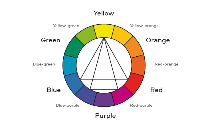
According to Itten, there are two main ways to combine three colors.
First, you can pick colors that are equidistant from each other on the circle. If you inscribe an equilateral triangle on the color wheel, the corners will point to the hues that look best together.
Using an equilateral triangle, we get combinations of both primary and secondary colors. If you turn the triangle inside the circle, you’ll get two more triads from tertiary colors.
Another way to create a harmonic triad is by adjusting the complementary scheme. Pick two colors on the circle that are diametrically opposed to one another – for example, blue and orange, and replace one of those colors with its two neighbors – instead of blue, use blue-green and blue-violet. The opposite also works – leave violet as it is and replace orange with the two tertiary colors that abut it on the circle.
The geometrical figure for this scheme is an isosceles triangle, which can also be rotated inside the wheel to uncover more combinations.
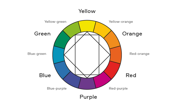
Using Itten’s color wheel, you can also combine four colors. Use squares and rectangles instead of triangles to do this.
The great thing about these geometric schemes is that you can use them in larger color wheels with more hues, too – as long as they’re formed by the same principles as Itten’s circle.
To combine colors using Itten’s color wheel, you don’t necessarily have to use geometric shapes. Of course, there are many more color chords that look good.
When discussing Itten’s theories and his circle, many people also refer to the analogous color scheme, although the master himself didn’t really use it. That alone, however, does not mean that the scheme itself is bad.
The point of the analogous scheme is to combine one primary color, one secondary color, and a tertiary color between them. For instance, yellow, orange, and yellow-orange. In other words, it’s a combination of three or four colors that lie next to each other on the color wheel.
Okay, so the theory is clear: yellow goes with purple, and orange with blue. But how do you actually use it in practice? It’s quite a challenge to edit a photo or a video using just two or three colors.
It’s all about emphasis. If you’re working with a two-color scheme, use the complementary colors on the objects you want to highlight. Here, for example, is how it’s done in the movie Amelie (2001):

The complementary scheme also comes in handy when you want to make the subject stand out from the background. For example, a person in dark yellow/orange clothes will look good against a blue sky (again, remember those movie posters), and a red shirt will work perfectly for a photoshoot in the green woods.
When using triads, try not to use the colors in equal proportions. Make one of them the main player, and let the other two complement it. As a guide, you can combine the colors in the ratio of 60%, 30%, 10%.
Remember, all these schemes are created to make your life easier, and not the opposite. If you find yourself struggling to count the percentage of each color in the picture, just let it go.
The goal here is simply to understand the principles so you can bear them in mind when you’re applying the latest color trends, using a color grading software or grading and editing on our own. Over time, you won’t even need to have the color wheel in front of you to see if colors go well with each other. It just takes a bit of time to develop a sense of harmonic combinations and avoid the ugly ones.